What Does That Mean For Commercial Interiors?
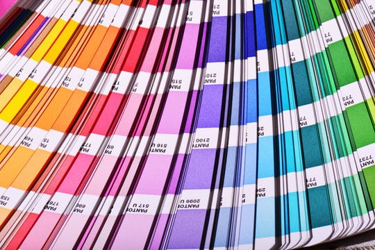
Color is one of the most powerful tools in design. It evokes emotions, creates connections, and tells stories in ways that words just can’t. Every year, industry leaders like Pantone, Sherwin-Williams, and Behr announce their “Color of the Year” selections. These announcements usually set the tone for trends in fashion, interior design, graphic arts, and more. These trending colors are more than just aesthetic choices; they reflect societal moods and aspirations, influencing creative industries worldwide. Designers across all industries look to these colors as they move forward with designs for the new year. Our design team is no different. We stay current and relevant with every aspect of our design work.
 Color trends are never random. There is a psychology to how and why colors are chosen in a certain year. They are carefully curated selections based on global events, cultural shifts, and collective emotions. For example, a calming blue might trend in a year marked by uncertainty, offering a sense of stability. Conversely, a bold, energetic red might be chosen during a time of cultural transformation, symbolizing passion and action. Designers across industries use these colors to tap into shared feelings, creating work that resonates deeply with their audiences.
Our team of designers will use the most current and trending colors to keep your business front of mind with your customer base. Whether you are rebranding, updating, or starting brand new, there is always a creative avenue for pairing and blending what’s trending into your current color scheme. It just takes a GREAT and TALENTED designer to see it. That’s where we come in!
